Nen Health

Nen Health

Nen Health

Case study

About Nen Health

About Nen Health

Nen Health is dedicated to the creation of a mobile application aimed at supporting child patients in oncology centers, considering the various activities they can perform, specific needs and treatment categories. For this, elements of gamification, construction of a strong visual identity and support of health professionals were taken to create an environment prepared for learning, support and monitoring of participating users.

Project goals

Project goals

Nen Health was proposed as a holistic product, focused on fulfilling the task of providing support and containment to children in different modalities of hospitalization and oncological treatment. This is achieved through activities and the companionship of the different characters inside the app.

Nen Health was proposed as a holistic product, focused on fulfilling the task of providing support and containment to children in different modalities of hospitalization and oncological treatment. This is achieved through activities and the companionship of the different characters inside the app.

The construction

The construction

For this project we used a metodology related to Garret’s design process specially in regards of strategy, scope and structure as initial steps going into skeleton and surface of the project as later instances, each with their needed deliverables paying close attention to iteration and evaluation of both usability and business needs.
As said before this is an holistic project, and all steps were taken into consideration for the development of the project, from the intial investigation to the illustration, motion design and visual system.

Defining the goals

Defining the goals

Comprehensive project focused on the creation of an interactive app for cancer patients, especially focused on ages 7 to 12 years.

  • Create an accessible, friendly and supportive environment for children that keeps their attention.

  • Build a concrete base of user research using interviews, research on competitive products and gamification tools to apply the practices recommended by professionals.

  • Constant monitoring with trained professionals to establish recommended exercises and integrate them into the created visual system.

  • Coordinated creation of a consistent visual system with the use of both illustrations, as well as sound and complex animations to present a complete prototype.

Strategy - Research

Strategy - Research

Strategy - Research

To establish a reference point to place Nen Health in the market, after the requirements workshop, an instance of competitor analysis was carried out, where both mobile health applications and applications, games and programs aimed at children were taken into account. . For each typology, several values ​​were taken into account:


Heath applications

Heath applications

Heath applications

  • Clarity in text and information

  • Records of important actions (medication, visits, etc.)

  • Monitoring of patient treatment

  • User opinions and suggestions.

Child-oriented applications

Child-oriented applications

Child-oriented applications

  • Easy to access information

  • Use of color and visual/auditory tools to maintain attention

  • Monitoring of activities and use.

  • Gamification.

This take us to the main insights of this step:

Personalized health tracking
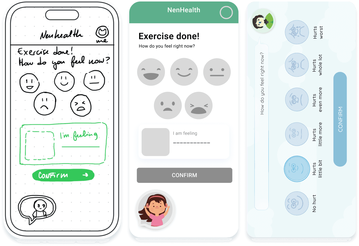
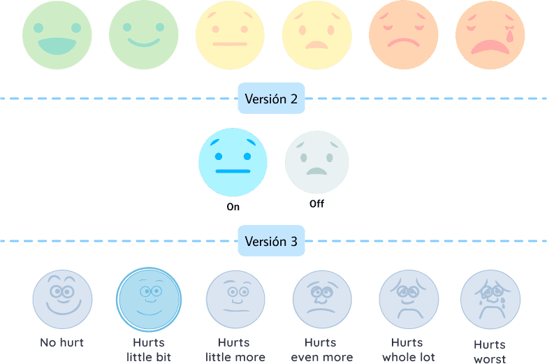
Mood tracking

Positive reinforcement

Comparative graphs

Scope - MVP construction

Scope - MVP construction

Scope - MVP construction

In this step we definey the scope of the product, creating an MVP of most relevant and needed features. This will then be passed to every other part of the group, or in this case created alognside with them.

IDEATE - Navigation and hierarchy

To mark the navigation hierarchies, in this case, a 'mega menu' was created where the necessary categories can be easily accessed. This format provides the ability to incorporate or remove sections depending on the needs of each site, taking into account that Roche's offers or properties in different regions may vary, with products enabled or products not available.


Information Architecture

Structure- Navigation and hierarchy

Structure- Navigation and hierarchy

To mark the navigation hierarchies, it was decided to make two first options, which were evaluated and iterated to their current version. This same architecture was also modified when new activities were incorporated, but with special focus on navigability and user experience.


Information Architecture

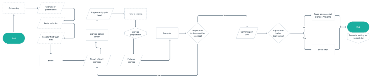
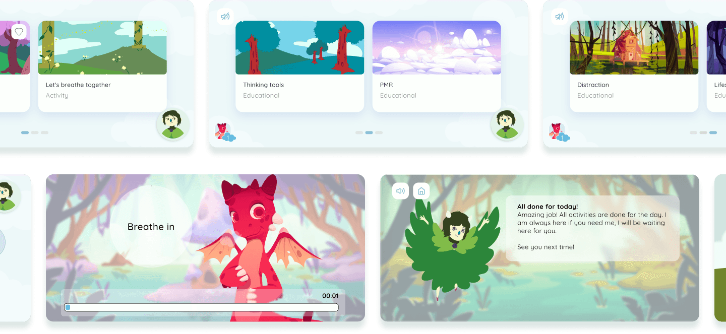
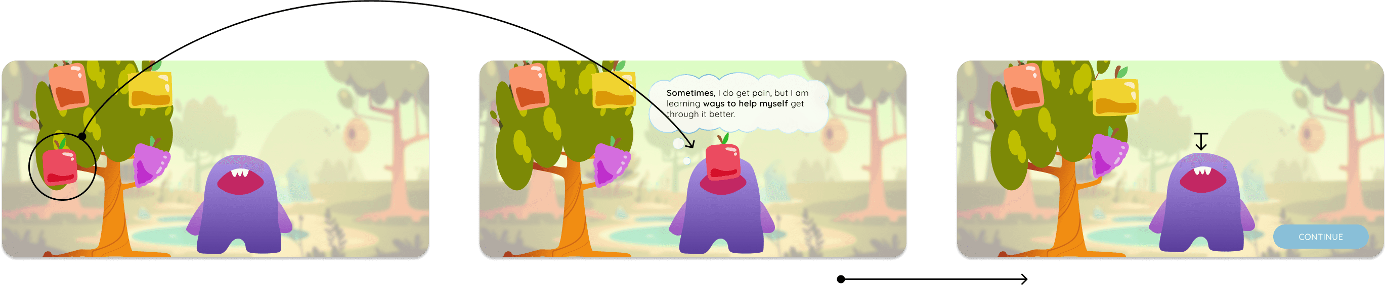
Listing the recurring iterations, one of the important points was to organize the number of possible actions within each activity, going through different modifications following the tests carried out.


Navigation elements

Skeleton / Surface - Low-fi & Hi-fi wireframes

Skeleton / Surface - Low-fi & Hi-fi wireframes

As we previously mentioned, one of our main challenges was the creation of a visual system that invites interaction but at the same time provides space for learning and accessibility of use. For this, multiple iterations were made in the design of the color palette, the character design and the distribution of elements in the background.

The color in Nen

The color in Nen

One of the most common interaction elements, the pain scale, was one of the first iterations in terms of color. While originally a scale in a red - yellow - green color system was proposed, a neutral system was finally chosen that would show active, inactive and selected so as not to influence the decisions of users with a color system that indicated 'error'. '' more than discomfort.

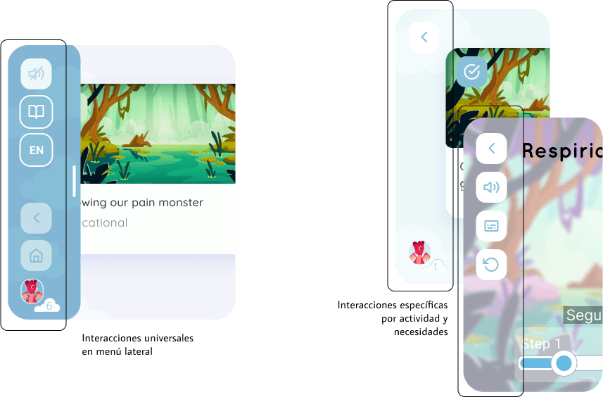
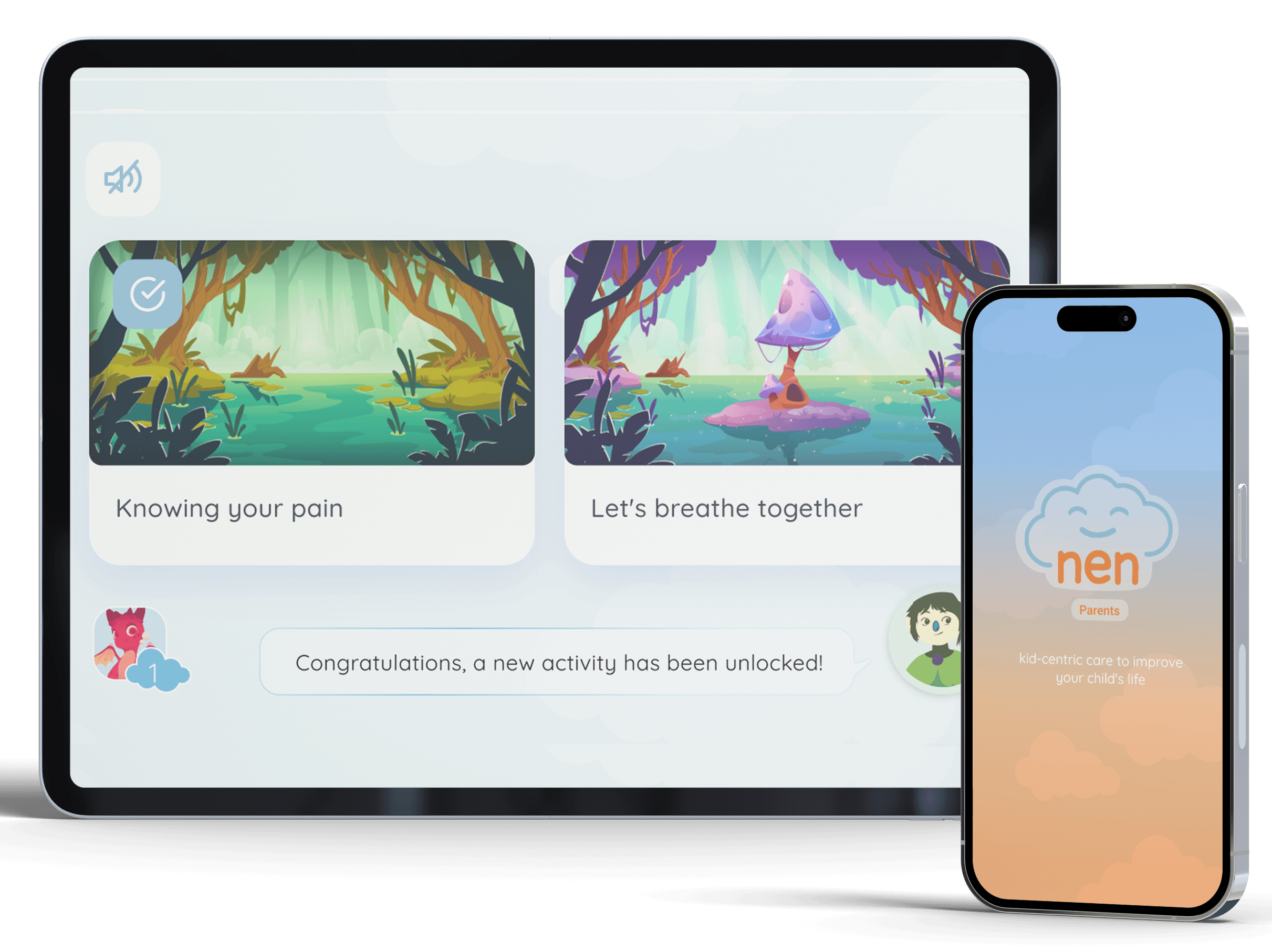
The illustration in Nen

Another process to highlight in this project is the construction of scenarios and screens, which in addition to monitoring the viability of the actions to be carried out, give a clear indication of where each activity is located.

Another process to highlight in this project is the construction of scenarios and screens, which in addition to monitoring the viability of the actions to be carried out, give a clear indication of where each activity is located.

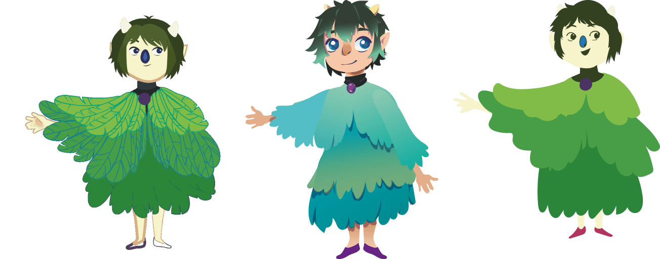
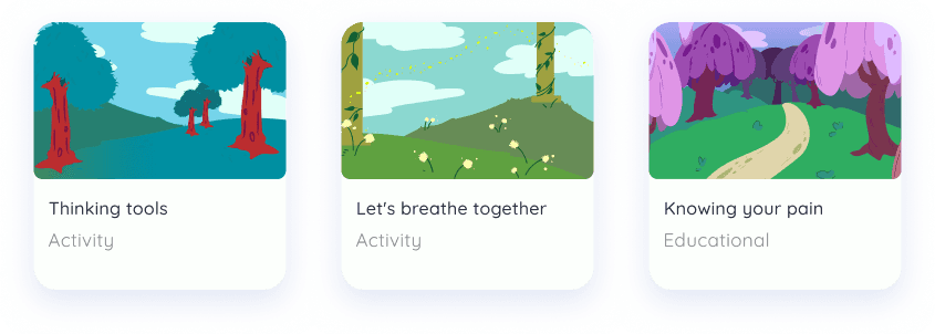
Scenaries were used to create different spaces where activities can be performed, receiving a feedback for each action. Each activity have their own blackground and elements, besides the recurring elements such as the avatar (the dragons) and the companion (Dolores)

Motion UI

Motion UI

Motion UI

To facilitate the task in the development of the product, in addition to the animations created in the prototype, the transfer of them - as well as the preparation of illustrations for their movement - was incorporated into the Rive platform, where they could be exported as javascript code for be incorporated directly into the programmed product.